Discover in this article how to analyze the consultation of your content.
The analysis of your content is possible through the feature. Access to the dashboard is done in the general menu of the administrator interface.
📸 View access to the dashboard

The "Content" tab of the Mayday dashboard allows you to analyze in a granular way the level of consultation of the contents of your knowledge base.
💡 Preliminary remark
For each type of data, you will notice the use of this legend:
Applied filters:
📚 Knowledge base
👨💻 Selected user groups and labels
📆 Selected time period
It represents the types of filters applicable to the documented graph or statistic. If one of the applied filters is crossed out, it means that this type of filter, even if it is filled in, will not be taken into account in the calculation of the graph or statistic.
🎯 Use case
Analyze the most consulted content to identify recurring customer cases and the most frequently treated topics by your advisors!
Analyze the satisfaction scores of your content!
Identify the most frequently consulted diagnostic steps!
Identify the reliability rate of the content in your knowledge base.
See which keywords do not yield any results to optimize the referencing of the relevant content.
📈 Evolution of consultations
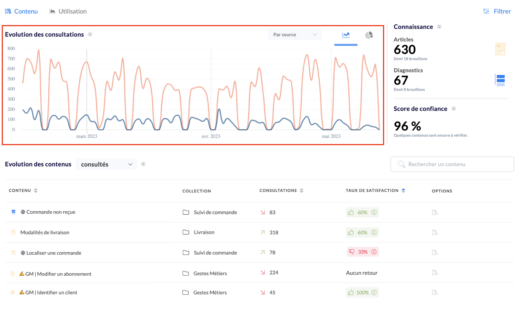
This graph allows you to analyze all consultations made in Mayday in relation to the applicable selected filters.
Applied filters:
📚 Knowledge base
👨💻 Selected user groups and labels
📆 Selected time period
We define a consultation as an action consisting of reading an article or browsing a Mayday diagnosis.
NB: browsing 2 steps in the same diagnosis counts as 1 consultation.
You can analyze consultations based on two different parameters:
Collections at the root (parent collections of the knowledge base)
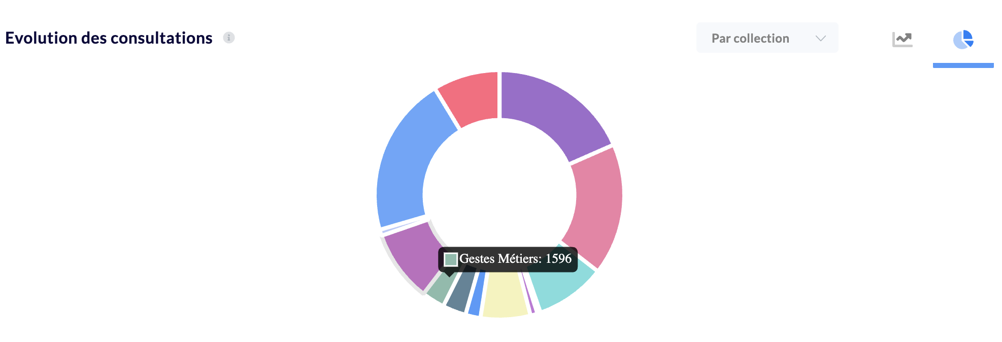
Analyzing by collection allows you to obtain an overview of the total consultations of Mayday distributed according to different themes.
Consultation sources (Mayday interfaces used → Mayday Knowledge - Full page, Zendesk pane, Chrome extension…)
Analyzing by source allows you to know on which Mayday reader the knowledge is consulted.
Indeed, depending on the setup and seniority of some advisors, some prefer to have the Mayday Chrome extension to have all the information directly in the work window, others with a double screen prefer to have a full page version with Mayday Knowledge.
You can opt for two different visualizations of this data, either as a line chart to analyze the evolution, or as a pie chart to analyze the distribution.

📖 Knowledge
This section gives you an overview of your knowledge base through three key indicators:
The number of articles;
The number of diagnoses;
The confidence score.

Applied filters:
📚 Knowledge base
👨💻
Selected user groups and labels📆
Selected time period
1⃣ Articles
Represents the number of articles written in the knowledge base at the moment. The sub-number represents the articles in drafts.
2⃣ Diagnoses
Represents the number of diagnoses written in the knowledge base at the moment. The sub-number represents the articles in drafts.
3⃣ Confidence score
Represents the number of contents to be verified divided by the total number of contents in the knowledge base. It thus represents the reliability rate of your knowledge base.
Once your new content is written and up to date, remember to change its status to "Verified" → see the article .
Regularly updating obsolete content is a necessity to avoid the number one scourge of any knowledge base. Maintain a high confidence score for better operations.
📝 Content consultation
1⃣ General table
The table presented on this Mayday dashboard page allows for an in-depth analysis of each Mayday content.
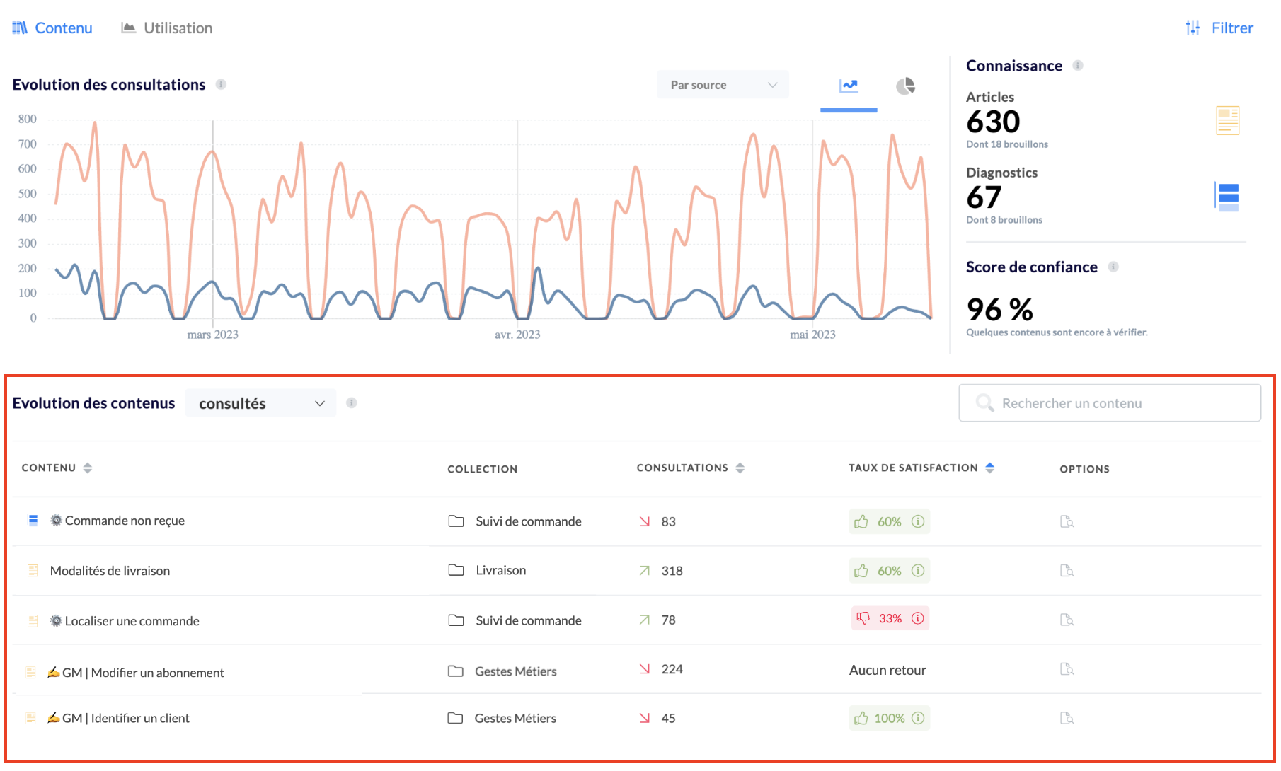
Thus, for each content, you will find:
The name of the content and its type (article or diagnosis);
The parent collection (note that this is the parent collection and not the root collection in which it is located);
The number of consultations associated with this content;
The satisfaction score of this content (the number of likes/dislikes issued by your advisors);
The possibility of analyzing these metrics in detail and their evolutions by clicking on the small magnifying glass.
Applied filters:
📚 Knowledge base
👨💻 Selected user groups and labels
📆 Selected time period
You can analyze both consulted and non-consulted contents by clicking on the drop-down menu at the "Content Evolution" title level.
At each of the tables, you will have access to:
- a search by name;
- pagination on all result pages (10 results per page);
- the possibility of displaying data in ascending or descending order by clicking on the arrows to the right of the name of each category: 
- the possibility of downloading the data of this table in XLS format for more precise analysis.
2⃣ Detailed analysis modal
The detailed analysis modal is a very advanced feature that allows you to analyze in a very detailed and granular way at the micro scale of each content the evolution of consultations, the metrics associated with the content, and the distribution of paths in the case of a diagnosis.

Thus, for each content, you will find:
The evolution of consultations by sources;
An overview of content usage;
For diagnoses, the distribution of paths.
Applied filters:
📚 Knowledge base
👨💻 Selected user groups and labels
📆 Selected time period
Evolution of consultations by source
This chart allows you to know on which support the content in question was consulted.
📸 View the "Evolution of consultations by source" section
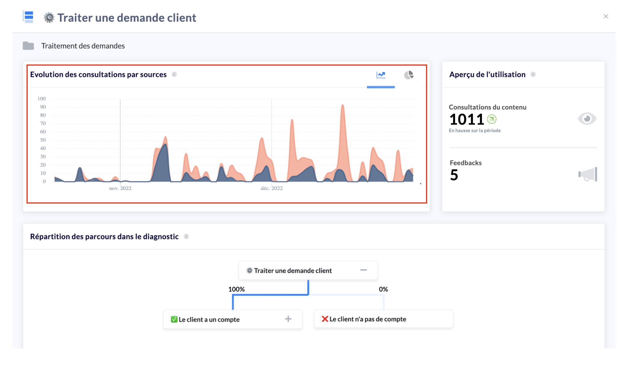
You can opt for two different visualizations of this data, either as a line chart to analyze the evolution, or as a pie chart to analyze the distribution.
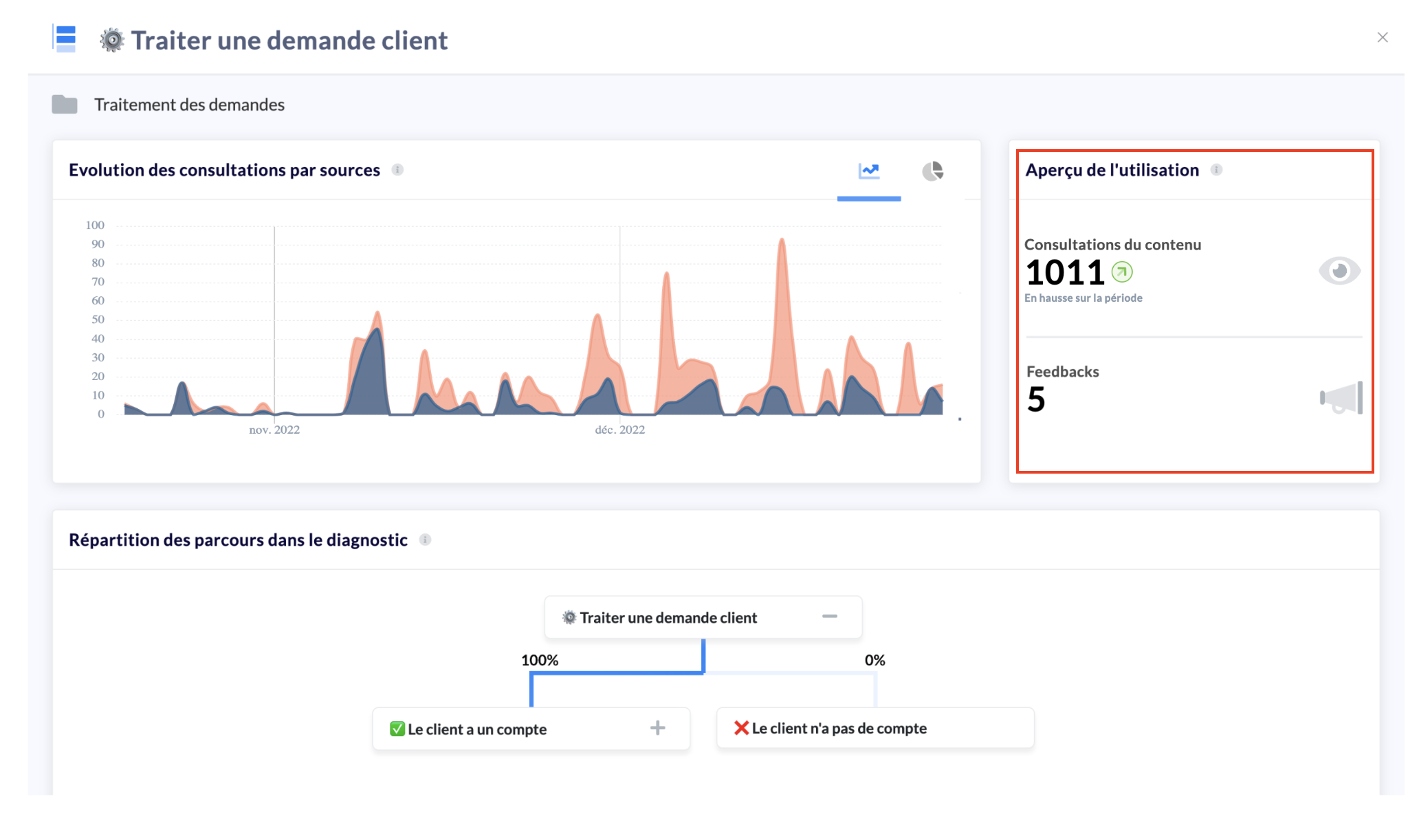
Overview of usage
Analyze all KPIs here:
Content consultation: number of consultations recorded for this content on the selected time period;
Feedback: number of feedbacks made on this content on the selected time period.
📸 View access to the "Overview of usage" section
Distribution of consultations by step (diagnostic format only)
This very advanced feature allows you to have the distribution of paths in a Mayday diagnosis in the form of a flow chart.
Indeed, you will be able to see among the branches of the diagnosis, which ones are the most used, the most useful, and deduce the most complex parts of the business processes.
📸 View access to the "Distribution of paths in the diagnosis" section
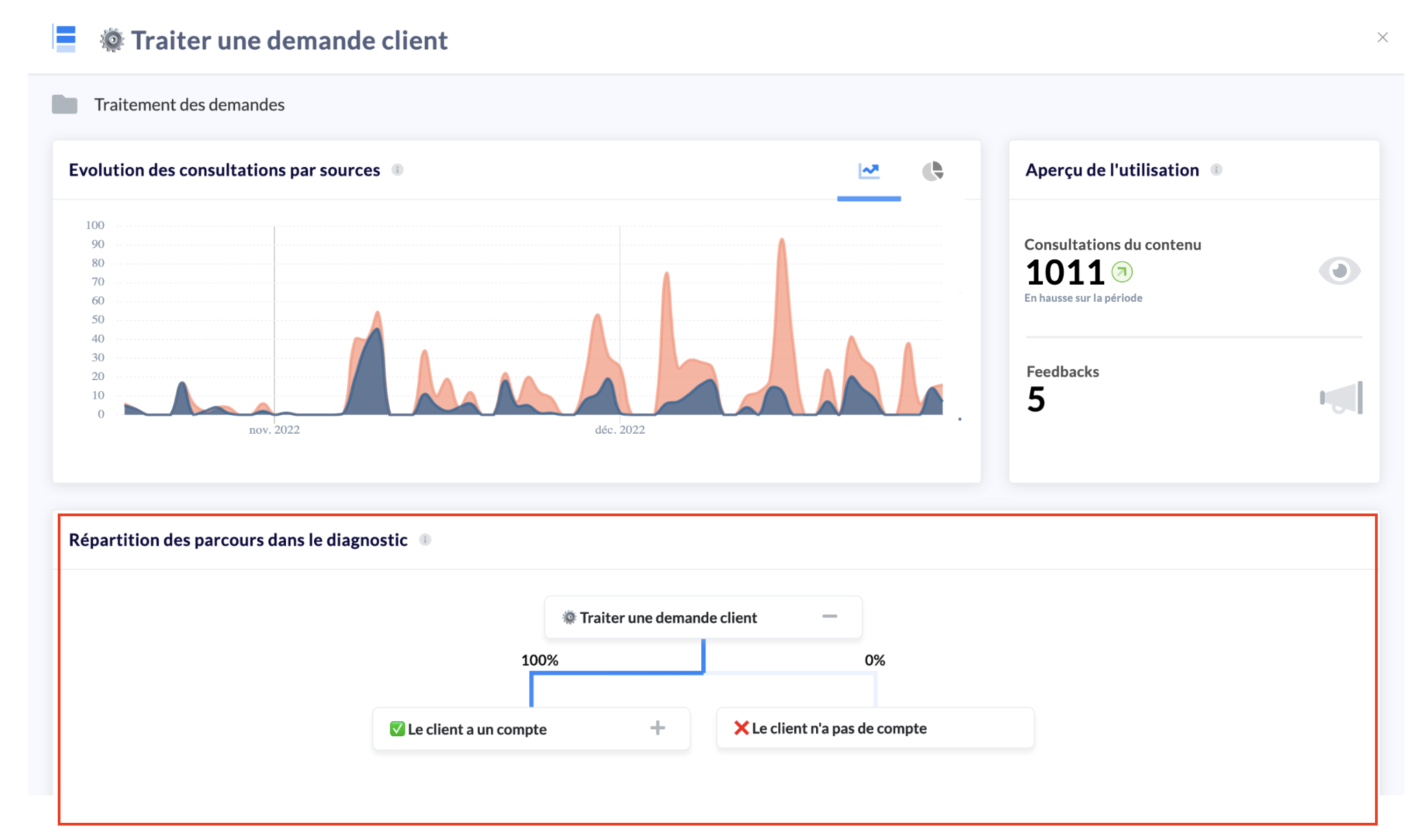
Attention: we are talking here about percentage distribution.
Indeed, some steps may be more consulted than their parent because the search engine or automations can lead directly to this step without having to navigate through the parent step.
That is why we give the distribution in percentage and not the number of consultations.
👁 Search analysis
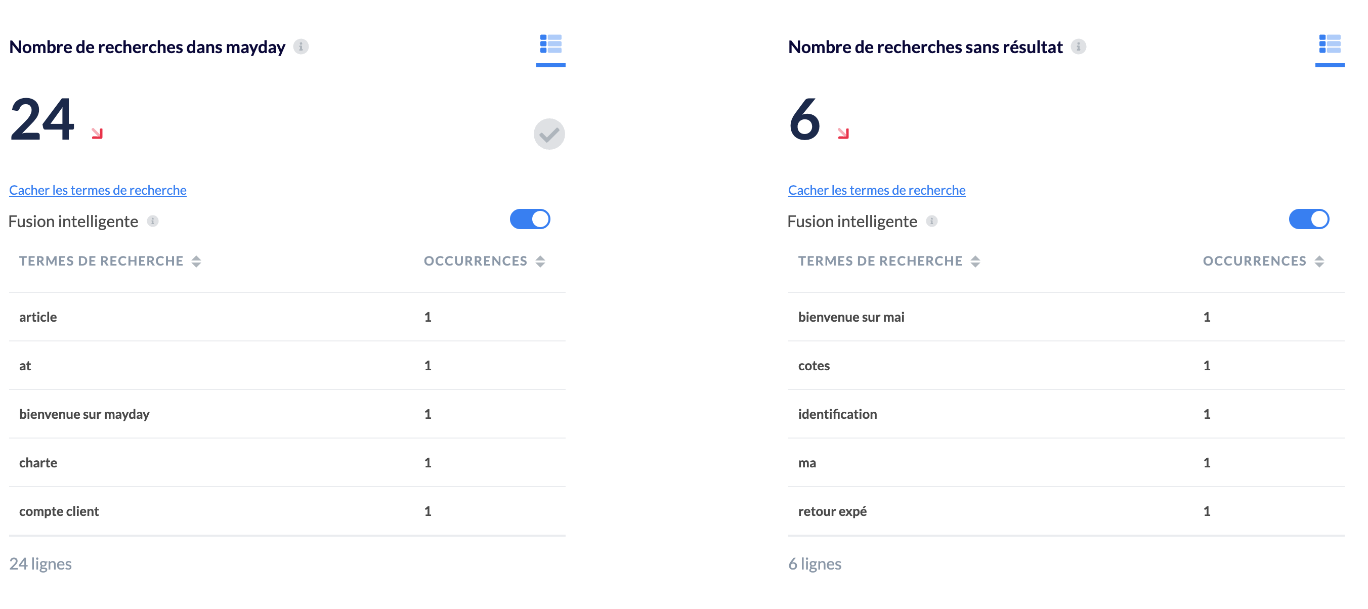
This section provides indications on the terms/keywords typed by advisors in the search engine.
📸 View keywords by advisors
Applied filters:
📚 Knowledge base
👨💻 Selected user groups and labels
📆 Selected time period
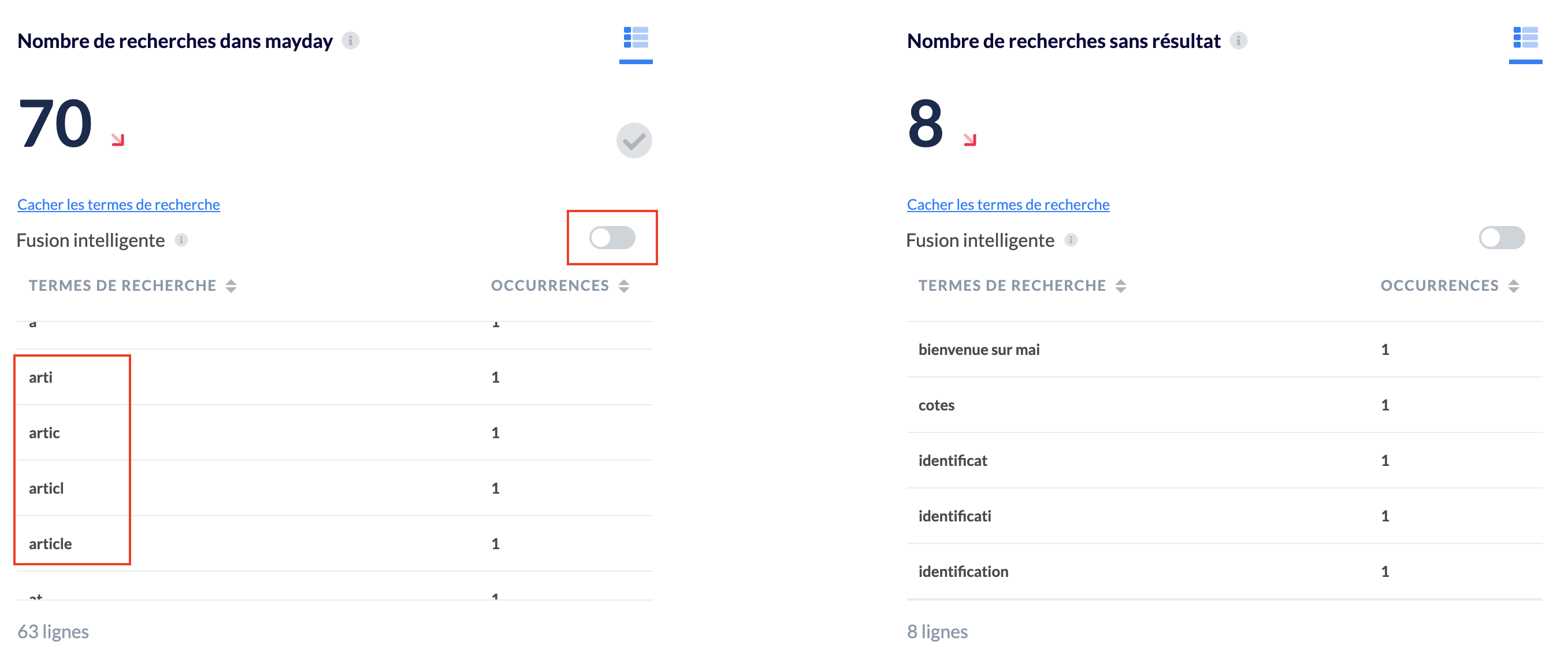
💡 Intelligent fusion
By default, similar terms are merged for intelligent grouping of similar keywords.
You can disable this feature if you wish.
📸 View keywords when intelligent fusion is disabled
📸 View keywords when intelligent fusion is activated
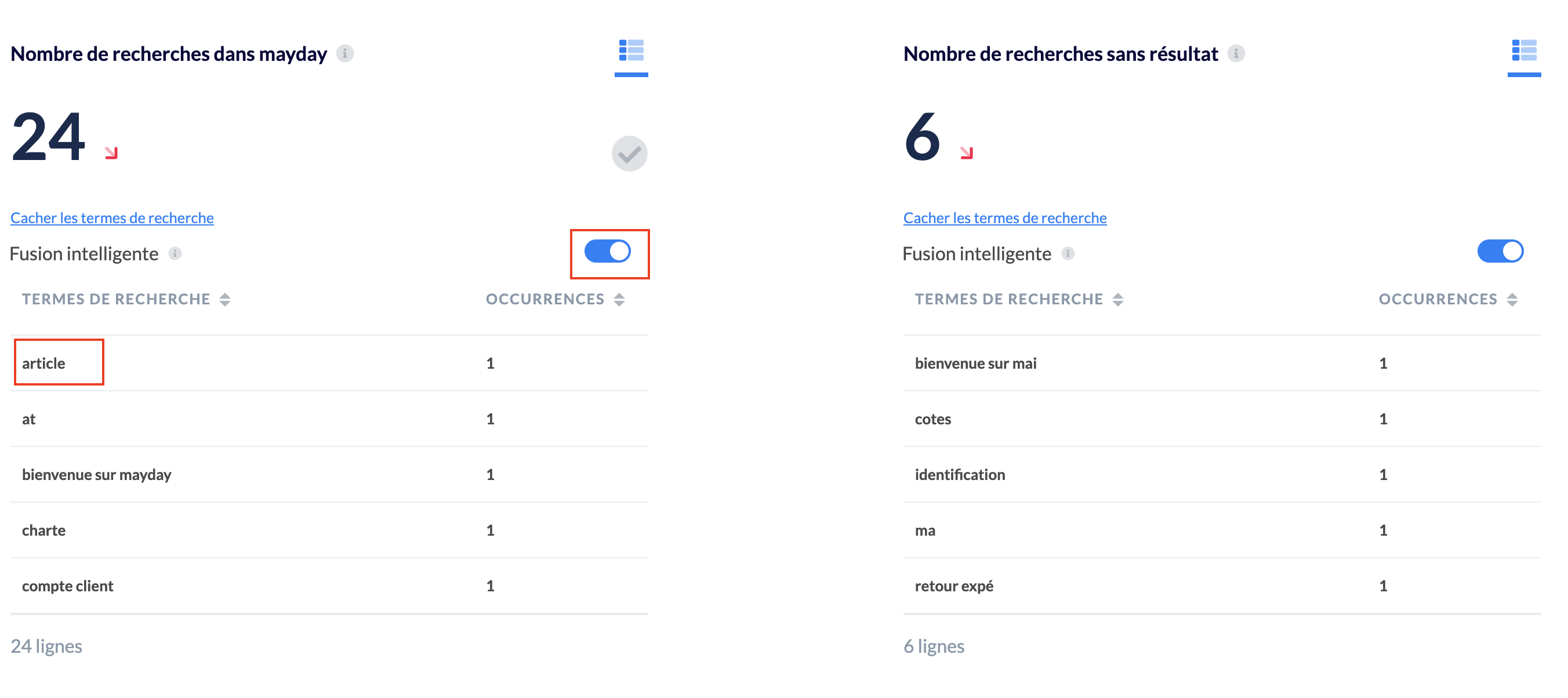
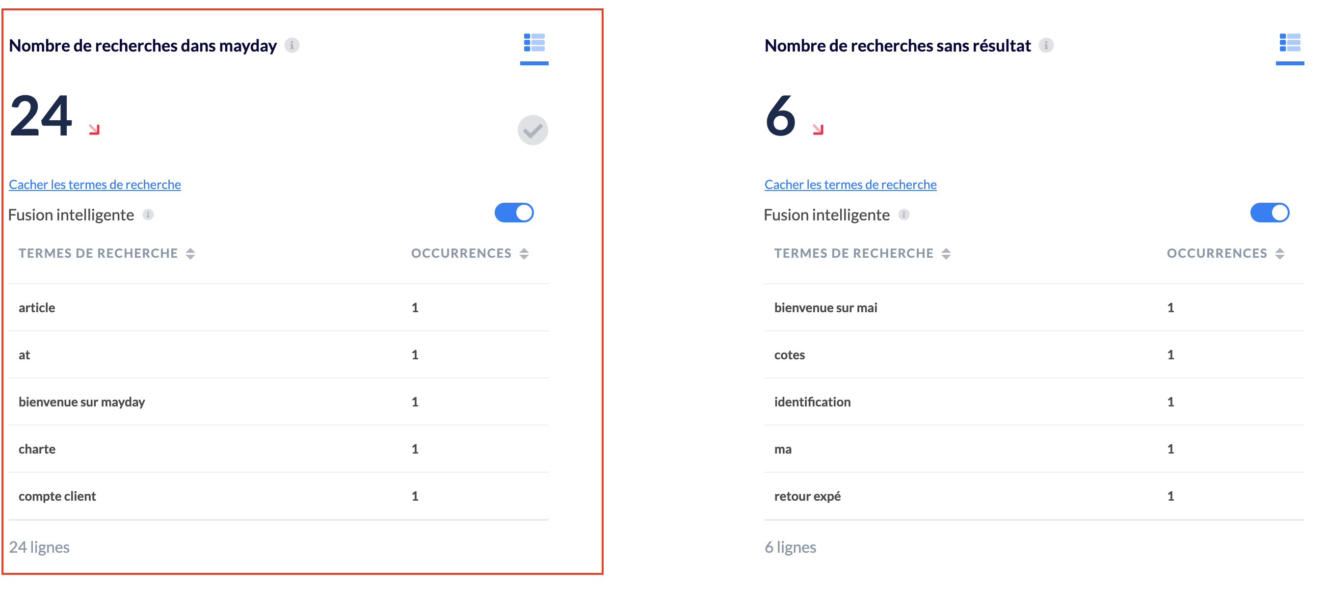
1⃣ Searches with results
This metric represents the number of searches (via the search bar) that displayed solutions.
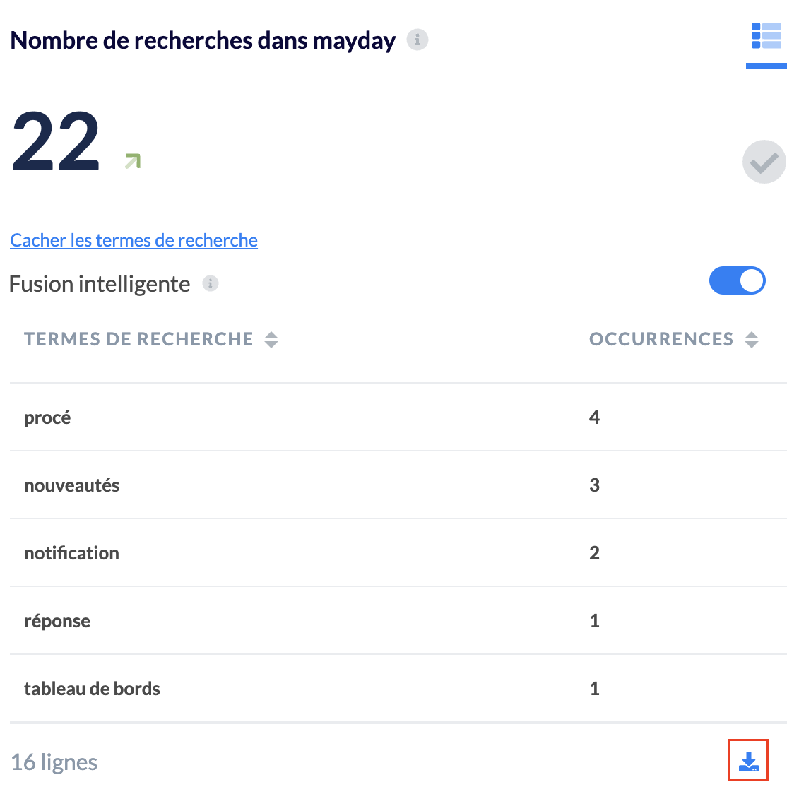
To facilitate the administration of these terms, you can directly download the list of successful and unsuccessful terms in excel format.
📸 See how to download search terms
This metric does not indicate whether the user clicked on one of the search results.
These are searches via the Mayday search engine. Thus, this number may be different or even higher than the total number of Mayday consultations.
2⃣ Searches without results
This metric represents the number of searches (via the search bar) that displayed no solutions. That is, the keywords typed did not result in any article or Mayday diagnostic suggestions.
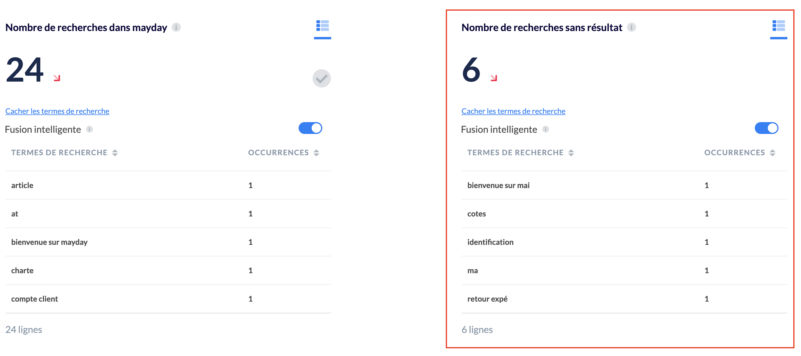
To continuously optimize your Mayday knowledge base, we invite you to reduce the number of searches without results as much as possible by using the content labeling feature to better index them in the search engine.
To discover how to analyze the consultation of your content, go to the article !