📕 Presentation
Discover in this content how to create user labels in the settings.
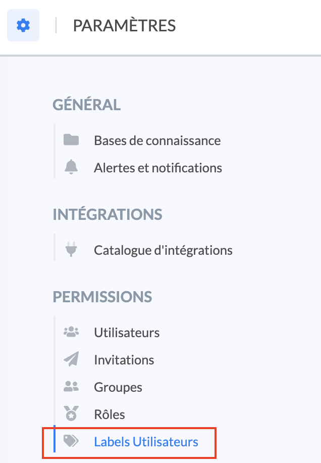
This feature is located in the " Settings" tab of your Mayday account.
📸 View access to settings

📸 View access to user labels
Groups allow you to create subgroups of users to refine their distribution, based on specific criteria.
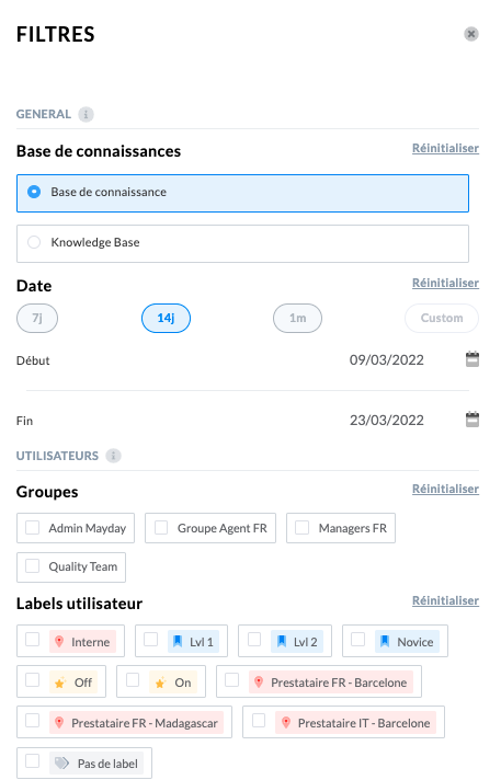
These labels will add additional filters within the dashboard and allow you to analyze the performance of users associated with the selected label → see the article for more information
Each user can hold one or more labels that will allow them to be categorized.
This feature is divided into three steps:
🎯 Use case
Assign an additional attribute to identify your users more granularly by typology.
Analyze your users' performance in more detail in the dashboards by filtering by label!
🏗 Step 1: Create axes
An axis represents a category of labels. You can add the necessary labels within the same axis.
The axis is both a categorization axis and an analysis axis. For example, if you have teams spread across several locations, you can create a "Location" axis in which you will have the Paris, Marseille, and Tahiti labels. Thus, at the level of each user, you can assign a precise location.
If you want to be able to distinguish between trainee advisors and senior advisors, you can create a Seniority Axis in which you will find different labels such as:
In training
3-6 months
Expert
To create axes, click on "Create an axis".

📸 View how to name the axis

For each axis, the following modifications can be made:
✍ Rename;
📸 Modify the icon and its color;
❌ Delete.
📸 View how to modify an axis

The name of the axis is not visible on the "Users" interface.
However, the icon and the color of the axis icon are visible on the "Users" interface, after integration of the labels (2nd step) in order to distinguish the labels according to their axis.
📸 View the labels on the user management center

🏗 Step 2: Create labels within axes
Labels are the tags that you will associate with the axes and then assign to users to conduct your analyses.
Thanks to user labels, you can distinguish different types of advisors within the same group.
Note: A user can only have one label per axis. Define your axes so that you have distinct labels (an advisor in Marseille cannot be in Paris).
To create one or more label(s) in this axis, simply click on the icon "+" located on the right of the name of the axis that has just been created:
📸 View how to create a label

📸 View examples of created labels
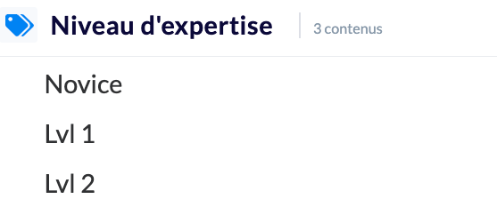
For each label, the following modifications can be made:
✍ Rename;
❌ Delete.
📸 View how to rename or delete a label
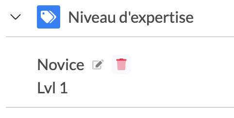
Attention: if you delete a label, it will be automatically deleted on all users who held it.
🏗 Step 3: Assign labels to users
To assign labels to users, it is necessary to distinguish the following two cases:
✅ If users have already been created: go to the article to edit the label(s) of the users concerned.
⏳If users have not yet been invited or their invitation has not yet been validated, go to the article to edit the label(s) of the users concerned.
🌟 Tips for successful implementation
First analyze the typology of your customer service and distinguish the different axes (geographical, level, seniority, etc.).
Create the categories in Mayday by choosing the icon that best suits you.
Create the labels for each category.
At the level of the management table of your users, assign the appropriate labels to each user.
Refer to the dashboards to conduct your analyses.
💡Good to know:
- You can modify the assigned labels of a user at any time.
- Do not create a category "Advisors Marseille" and another "Advisors Paris". Instead, create the "Location" category with two labels.
💡 Ideas for label axes
To help you implement this feature as best as possible, here are some ideas for axes that may be relevant:
🗺 Location
Paris
Barcelona
London
👨💻Telework rhythm
6am - 3pm
9am - 6pm
11am - 8pm
🎖 Seniority
<1 year
Between 1 and 3 years
>3 years
📚Level
Lvl 1
Lvl 2
🏷 Team name or name of the manager/team leader
AV
SAV
🌟 Specialty
Product range
Sector
…
📸 View examples of labels
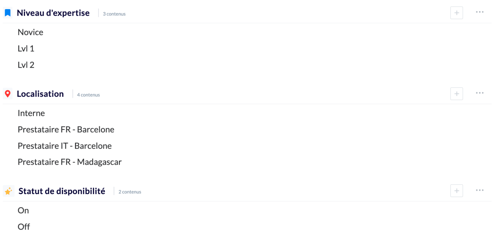
📸 View labels as filters in the dashboard
